You can interact with the dashboard by clicking start. Optimal viewing is on browser.
Who is this data visualization for?
The target audience for this data visualization is LGBTQ film curators who are curious about the top queer films recommended by film critics. Additionally, as someone who once sought guidance in LGBTQ films as an 18-year-old, I want to dedicate this visualization to queer youth looking for movies that can inspire or help them navigate their lives as gay individuals.
Development of sketches and wireframes
To conceptualize this data visualization, I started with sketches in the early stages to explore different layouts. I played around with film- or movie-related icons and images to find a suitable design.

After prepping and cleaning the data, I created rough visualizations in Excel and Tableau to test my ideas. I then sketched several layout possibilities to determine the best way to present my findings.


As shown above, I initially considered presenting the films chronologically on a film reel as a timeline. However, I decided to focus on conveying the information quickly and opted for four possible concepts:
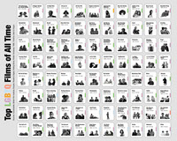
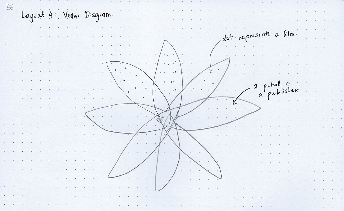
1) DVD shelves:
The idea is to mimic DVD shelves, but this may seem a little outdated since most of the movies we watch nowadays are available on streaming platforms. However, the challenge lies in dealing with titles that appear on multiple lists and figuring out how to connect them. Fortunately, this can be easily achieved on Tableau.
The idea is to mimic DVD shelves, but this may seem a little outdated since most of the movies we watch nowadays are available on streaming platforms. However, the challenge lies in dealing with titles that appear on multiple lists and figuring out how to connect them. Fortunately, this can be easily achieved on Tableau.

2) Circular Sankey
The idea here is that the inner circle represents each list, which is connected to the outer ring representing the film.
The idea here is that the inner circle represents each list, which is connected to the outer ring representing the film.

3) Voronoi Treemap
The idea behind this visualization is that each circle represents a publisher, and the circle is divided based on the rank of the film on their respective lists. The higher the position on the list, the larger the region of the circle assigned to the film.
The idea behind this visualization is that each circle represents a publisher, and the circle is divided based on the rank of the film on their respective lists. The higher the position on the list, the larger the region of the circle assigned to the film.

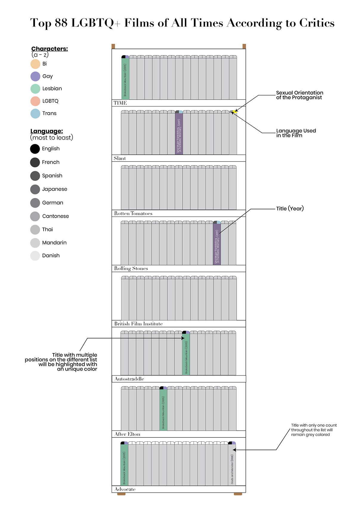
4) Venn Diagram
The Venn diagram will show where films overlap on different lists, but it's tricky to create due to the many subsets. I also considered a flower-like shape but it turned out to be too complicated.
The Venn diagram will show where films overlap on different lists, but it's tricky to create due to the many subsets. I also considered a flower-like shape but it turned out to be too complicated.
Iteration on the sketches and digital mockups creation
Now comes the fun part, wireframing these sketches. Again, I used Tableau (this is where the visualization will live) and Illustrator to wireframe them.
1) DVD shelves:
After careful consideration, I have decided to abandon this idea. While it may be visually appealing as a poster, I do not believe it effectively conveys information at a glance. Additionally, the color-coding I designed for the top of each DVD may be difficult to read and could distract from the overall message. Despite this, I am glad I explored this concept.
After careful consideration, I have decided to abandon this idea. While it may be visually appealing as a poster, I do not believe it effectively conveys information at a glance. Additionally, the color-coding I designed for the top of each DVD may be difficult to read and could distract from the overall message. Despite this, I am glad I explored this concept.

2) Circular Sankey
This visualization is designed for clarity and ease of viewing. The outer color of each film circle quickly shows which type of queer film is listed most often - gay, lesbian, trans, or bi. To keep the focus on the films, I will change the color of the connecting strands to grayscale.
This visualization is designed for clarity and ease of viewing. The outer color of each film circle quickly shows which type of queer film is listed most often - gay, lesbian, trans, or bi. To keep the focus on the films, I will change the color of the connecting strands to grayscale.

3) Film Reel
I am most confident in producing this layout which resembles a film reel and provides a quick overview of the data. The color coding also shows the frequency of different queer film orientations in the list. However, I was unsure about the best way to fill each circle, whether it's through Voronoi diagram, circle packing, or layers of circles.
I am most confident in producing this layout which resembles a film reel and provides a quick overview of the data. The color coding also shows the frequency of different queer film orientations in the list. However, I was unsure about the best way to fill each circle, whether it's through Voronoi diagram, circle packing, or layers of circles.
Building a dynamic data visualization using Tableau
I initially planned to visualize the data with a circular Sankey diagram, but I faced several obstacles, so I switched my focus to the Voronoi chart. Fortunately, I was able to transform the data using a data generator tool on Observable.
Layout, Position and Flow
Inspired by my previous data visualization for the 95th Academy Awards, I want to create an interactive visualization for this project that users can navigate from start to finish. In addition to the main visualization, which shows which group of protagonists dominates the chart, I will include a list of 88 shortlisted films and details about each of them.
Users can explore the top LGBTQ films based on director, release year, genre, runtime, ratings, and language. This way, users can interact with the data and explore the films they are interested in. Here is a sketch of the dashboard for each film and how users can interact with the page:
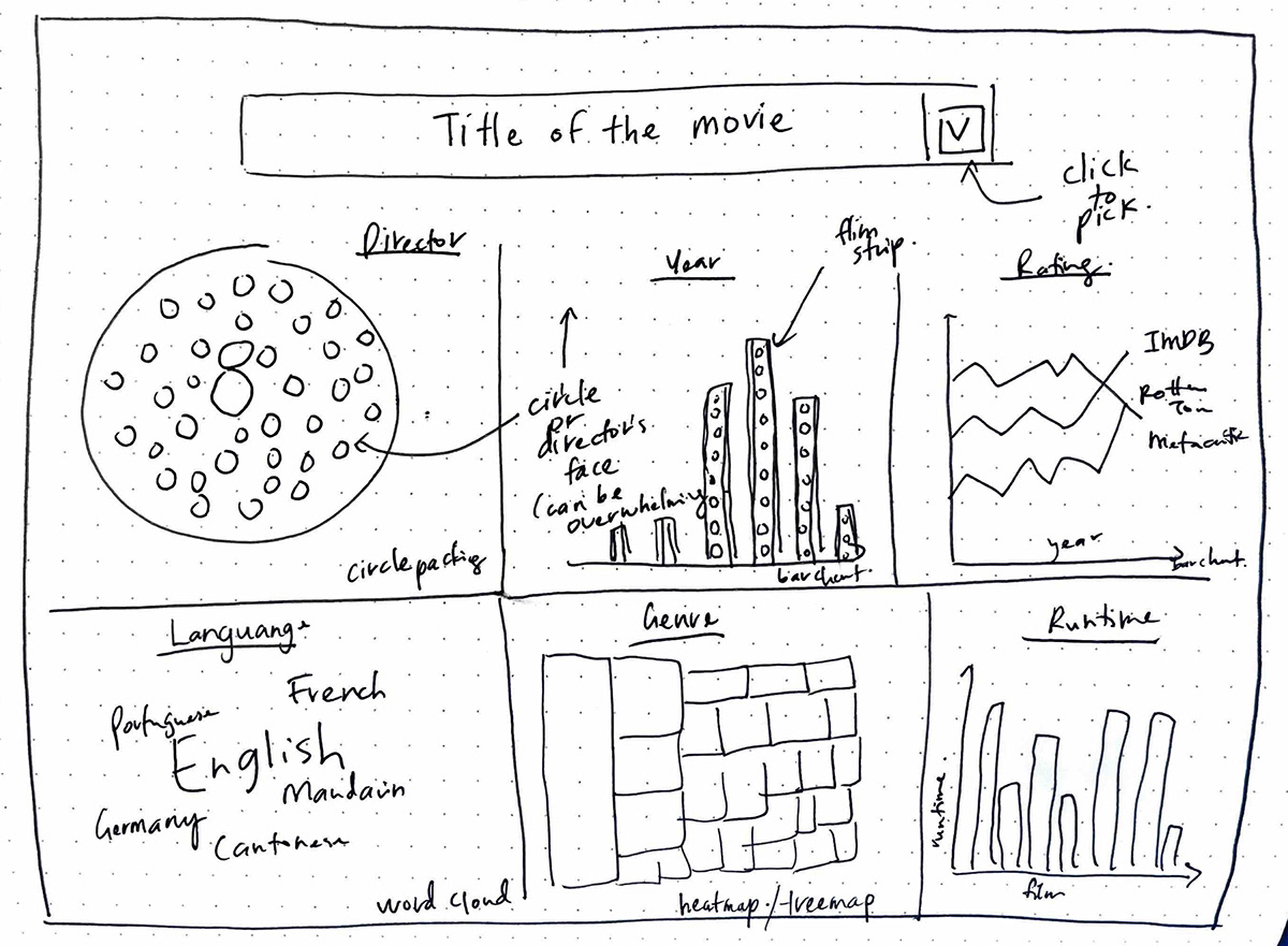

I created a wireframe based on my initial sketch, but I decided to make some changes to the layout. I felt that the initial design had too much white space, so I moved the circle to the center and placed each detail around it. Additionally, I switched from a drop-down menu to a bubble chart to display which film has been listed the most across all 10 lists.
I divided the data viz into 5 dashboards:
1) Intro:
It features a compilation of the top 10 queer films that were mentioned most often in the critically acclaimed lists. The films are presented through stunning imagery that will captivate your attention, and you can start exploring the data viz with just a click of the "Start" button.
It features a compilation of the top 10 queer films that were mentioned most often in the critically acclaimed lists. The films are presented through stunning imagery that will captivate your attention, and you can start exploring the data viz with just a click of the "Start" button.
2) Main Page:
You'll discover the most significant findings from the compiled lists, providing a great starting point for your journey into the world of queer cinema.
You'll discover the most significant findings from the compiled lists, providing a great starting point for your journey into the world of queer cinema.
3) Film Index:
All 88 films are displayed in a visually appealing format, making it easy for you to find out where and how to watch each movie.
All 88 films are displayed in a visually appealing format, making it easy for you to find out where and how to watch each movie.
4) Film Details:
Interactivity continues as you can use each film as a filter to access information on the year released, director, runtime, genre, language spoken, and ratings. It's an immersive experience that will keep you engaged for hours.
Interactivity continues as you can use each film as a filter to access information on the year released, director, runtime, genre, language spoken, and ratings. It's an immersive experience that will keep you engaged for hours.
5) End:
Includes a link to access the Google Sheets data that I used to create this data viz, so you can explore further. And, as a final touch, I've added a conversation outro to spark a dialogue with you and learn more about your thoughts on queer cinema.
Includes a link to access the Google Sheets data that I used to create this data viz, so you can explore further. And, as a final touch, I've added a conversation outro to spark a dialogue with you and learn more about your thoughts on queer cinema.
Tools
I used a combination of tools to create this data visualization, including Adobe Illustrator, Photoshop, and Tableau. Illustrator was particularly useful for creating the wireframes and layout of the Film Index. For the index, I decided to use a still image from each film. This process, however, was time-consuming, taking around 3-4 days to complete due to tasks such as searching, downloading, naming, saving, removing backgrounds, and converting images into black and white. Photoshop was used to edit photos of each film’s still.
Midway through designing the layout and background for the Tableau dashboard, I switched from Illustrator to Adobe XD, which made creating the layout and prototypes much easier. XD is less overwhelming than Illustrator and Photoshop, and eliminates issues with lagging.
Color
When it comes to color, I tend to lean towards minimalist styles, so I typically stick to black and white or sepia tones. However, finding a color that could represent the LGBTQ+ community proved to be a challenge. While searching for inspiration, I noticed that many representations of the community use flags as a form of color coding.
However, incorporating all four flags into my data viz seemed chaotic and overwhelming. After some consideration, I ultimately decided to choose a single color from each respective flag that I felt best represented its group - gay, lesbian, trans, and bi.
To enhance the user experience, I decided to include a complete list of all the films on one page, inspired by similar designs for must-watch movies on Pinterest. The films are presented in a grid format and can be downloaded as a hi-res version or printed as a poster.

Limits and Potential Improvement
If I had a deeper knowledge of computer science, there are a couple of things I would like to implement in my data viz. Firstly, I would try to create a Circular Sankey diagram as it could provide a beautiful and unique visualization. However, this requires me to figure out a way to create circular graphs on Tableau, which was pretty challenging. Secondly, I would like to add interactivity to the film genre section, where users can hover over each shape to see what genre the film belongs to.
Furthermore, I realized that the screen resolution and quality of the user's monitor when viewing my data viz are beyond my control. Hence, I designed the data viz to fit a browser desktop size of 1000px (W) x 800px (H), which is a relatively limited size for what I wanted to achieve.
Nonetheless, I am content with the final product, which took me almost three months to complete. If you click here, it will take you to the Tableau page.
I hope you will learn something new and enjoy the data viz.